On Continuity
One Palette, Several Rooms
B&Co. Surfaces · September 26, 2026 · 4 min read
Continuity does not require a houseful of matching rooms. Let a small relationship among color, line, and visual weight carry forward, then allow every space to adjust its volume, emphasis, and pace.
A palette is a relationship
Rooms can belong to one another without looking alike. The connection may be a pale background that receives a stronger object, a dark line that gives several compositions an edge, or a repeated balance between quiet planes and one concentrated gesture. The palette lives in that relationship. Individual colors and surfaces are its vocabulary, not its entire meaning.
B&Co. Surfaces describes material choices as part of both the character of a space and the visual language used to present it. That framing is useful across more than one room. Character can change from room to room while the visual language remains legible, much as a voice can change its volume without becoming a different voice.
Begin by naming the relationship worth carrying. It could be warm color against a restrained field, broad soft forms beside precise lines, or a small polished note within a matte composition. Keep the statement simple enough to survive translation. If it depends on every item appearing again, it is a list. If it can guide a new room without copying the old one, it is a palette.
Keep one note, change the volume
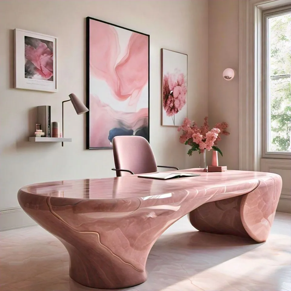
The lead image concentrates rose color in a sculptural desk and chair, then lets related tones appear more lightly in the artwork and flowers. Pale walls and daylight give that color room to register. The effect comes from distribution as much as selection: one substantial note, several quieter replies, and enough open field for the relationship to remain clear.
Another room could keep that logic while changing its intensity. The dominant note might shrink to an edge, move upward into a light fixture, or appear only in an object seen through a doorway. The supporting field could deepen while the accent grows quieter. Continuity remains because the parts keep their roles, even when their proportions change.
Carry the relationship from room to room; let each room decide how loudly to speak it.
This shift prevents repetition from becoming a pattern of identical moments. A passage can be spare, a gathering room expansive, and a private room subdued. Each can give the shared palette a different cadence. What returns is recognizable, yet the sequence still has progression: an introduction, a fuller statement, a pause, and a close.
Let each room speak in its own register
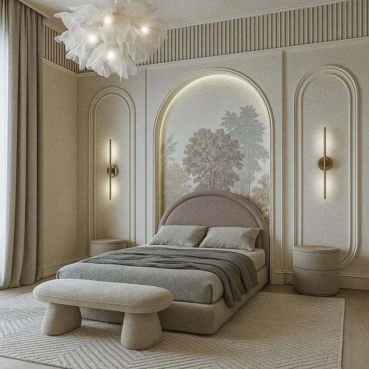
The second image works at another register. Its upholstered bed and bench hold the center low, while arched wall panels, a tree-pattern mural, linear sconces, and a leaf-like ceiling light draw the eye upward. Neutral color makes shape and outline more prominent. Here, the composition is carried by silhouettes and intervals rather than one saturated accent.
These two images are used here as separate visual studies. They are not evidence of one property, one built project, or one prescribed set of materials. Their value is in the comparison: the study with the rose desk organizes attention through concentrated color, while the bedroom organizes it through a quieter field and an ascending family of curves and lines.
B&Co.’s public integrated-project presentation offers a closer example of continuity within one design study. It labels the family room, kitchen, and bathroom images as architectural renderings and describes them as studies of how a material palette carries from one space to the next. The wording matters. They are renderings used to show an idea across rooms, not proof of completed conditions.
That distinction leaves the design lesson intact. A family room, kitchen, and bathroom ask different things of proportion and emphasis, yet a shared visual language can move among them. One room may give a surface the foreground. Another may let it become a border or background. A third may retain only its tone or geometry. The rooms stay individual because the translation changes with the room.
Carry the interval, not the inventory
A multiroom palette becomes more convincing when it preserves intervals instead of repeating an inventory. Consider the distance between light and dark, the amount of open field around a strong gesture, and the way one line answers another across a threshold. Those relationships can remain steady even as furnishings, surfaces, and focal points change. They give continuity a structure that is visible without becoming insistent.
The palette can also reserve surprise. When every room repeats its strongest note at the same scale, the sequence flattens. When one room holds that note back, the next appearance gains presence. Restraint becomes part of the language. A quiet room does not abandon the palette; it gives the more expressive room a place in the whole.
Picture the sequence as a walk: pale wall, a slim dark line, a broad neutral bed, then a doorway opening onto one rose-colored desk in daylight. Nothing needs to match piece for piece. The rooms remain distinct, but the spacing, weight, and measured return of color make the passage feel composed as one sentence spoken in several rooms.