Read the outline before the color
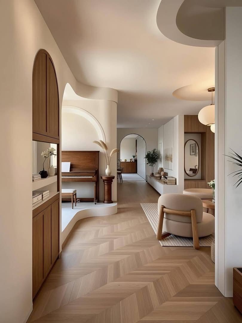
When several finishes sit close in tone, begin by tracing their outlines. Follow the face of a wall into a recess, around a curved corner or beneath a projecting roof. Ask where the surface seems thin, where it has weight and where an opening interrupts it. This is a reading of shape. It gives the palette a structure that a row of color chips cannot show.
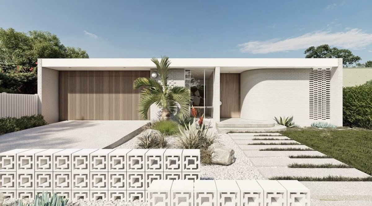
The lead image offers a useful study. A pale roof line stretches across the facade. Below it, narrow vertical lines mark the garage door, a doorway sits farther back, and an open-block wall occupies the foreground. Similar tones carry quite different geometries. The small openings and deep entrance are part of the composition, as visible as the warmer color of the door.
These images are separate visual references from the Beyder&Co. Pinterest account. They illustrate relationships of line, plane and depth; they do not identify a Beyder&Co. project or establish the composition of a pictured material. Keep the design observation precise enough to stand without a guessed product name.
Distinguish a line from a recess
MoMA’s art-term entry describes relief as forms projecting from a flat background (read October 16, 2026). That definition gives the word a physical basis. In a material discussion, use it to distinguish a shaped profile from a flat face carrying a drawn or printed motif. A dark mark may belong to a pattern, an opening, a joint or a shadow. Those readings can look similar in a photograph while suggesting different things about a surface. Pause over the distinction. If the appeal lies in a deep reveal, describe the reveal. If it lies in a fine repeated line, describe its spacing and the angle from which it becomes apparent.
In the exterior study, the open blocks create dark centers within a pale foreground. Across the facade, the garage door offers a much finer rhythm. The recessed entrance reads as a larger, quieter area of shade. Calling every one of these moments texture would lose the difference in scale that makes the image worth studying.
A restrained palette can hold a great deal of depth. Give its shadows the same attention as its colors.
B&Co. Surfaces presents its stone collection through light, veining and depth, and its wood collection through grain, tone and scale. That vocabulary invites a more complete conversation than pale, warm or neutral alone. A material direction can include how a face meets the light and how its visible profile relates to the adjoining plane.